To start my logo project, I started with changing the background of the artboard to a purple back ground then. Then I type out the text “Pateros Football” and “Go Billy Goats.” Then I changed the font size so it could be big enough to see if I was to use this logo on a shirt or poster. Then I changed the font style to Algerian. I then added two different Billy goat heads facing each other. That was the conclusion of my first draft. After I received some feedback from of my classmates, I saw that there was a lot of work to do. The first revision I made was using the pen tool to outline the Billy Goat heads so that they were my own creation and that anyone else’s. Then I changed the color fill of one of the heads to yellow and the stroke to white. I left one head white but changed the color stroke to white. This is the same has what I did with the text. I did it this way because the using purple fill or stroke was hard to see with the purple back ground. I then wrapped the text in an arc and added an inner glow to the “Pateros Football” and an outer glow to the “Go Billygoats.” I also added rounded corners to the words. Also, with the Billy Goat heads I added a wave warp effect. With the heads I also added a crystallization so the pixelization was different than just being normal. This logo is just a simple logo that could be used for a t-shirt or poster. It took a lot of work to put this logo together and get it to the point where it I felt it helped tell my story about why I love football. Using Illustrator was a different and fun experience that I enjoyed. I hope in the future that I am able to use Illustrator more with other kinds of assignments and just for fun to help me get more experienced.
Category Archives: Uncategorized
Logo draft
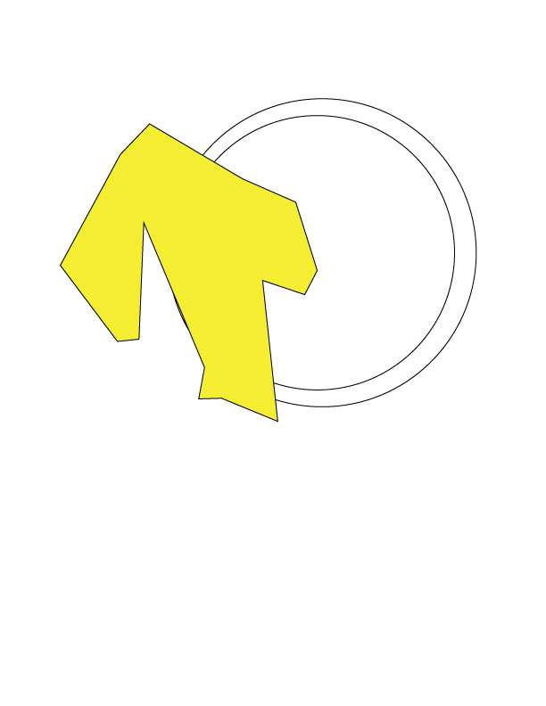
For my logo I am trying to make a logo that would work for my high school football team the Pateros High School Billygoats. I started by making the background purple. Yes, purple because was my schools primary color along with gold. I then use the typing tool to type Pateros Football and Go Billygoats. I then made the color fill of the Pateros Football gold and the stroke purple. For the go Billygoats I turned the color fill into white and the stroke is gold. I then added a Billy goat head in which I cropped down a little and will try to cut out so the head fits while into the background. The text style is Algerian, and the font sizes are different so I could fit the words on the page. I will probably change the template that I used so that I can fit all the words onto one line instead of two. I also changed the stroke fill on each so the two fills were different from one another. I then added a second Billygoat head and reflected the other head so that both were facing each other as if they were going to be put onto a poster. For me I struggled with illustrator because it was the first time ever that I have used it. It was a different kind of experience and I know that there is a lot of work to be done before it is finished. As for the story I am trying to tell with this poster is that my school sometimes does not get support like this and that I feel like their football team deserves attention. They work hard each week and play tough no matter who they play. I enjoyed working on this and I will continue to work hard to make it even better using more tools from within illustrator to make this an absolutely perfect representation of me and my story.
Logo Sketch
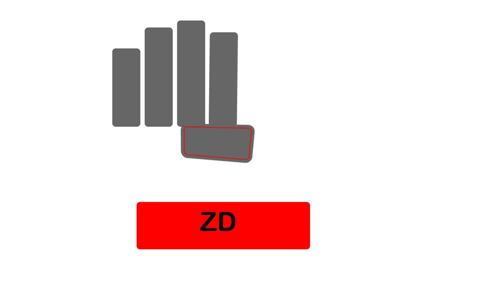
For my logo sketch I decided to do a logo that would work for my high school’s football team in block letters that they could use on a t-shirt.
Illustrator Tutorials.
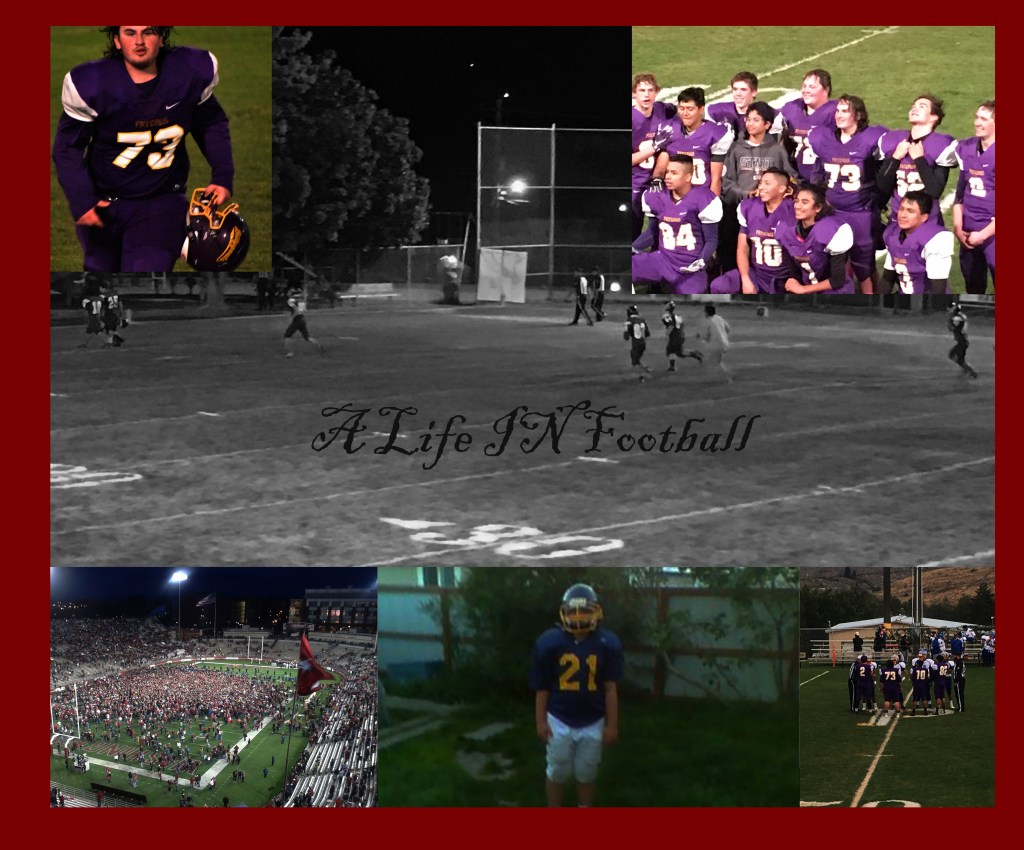
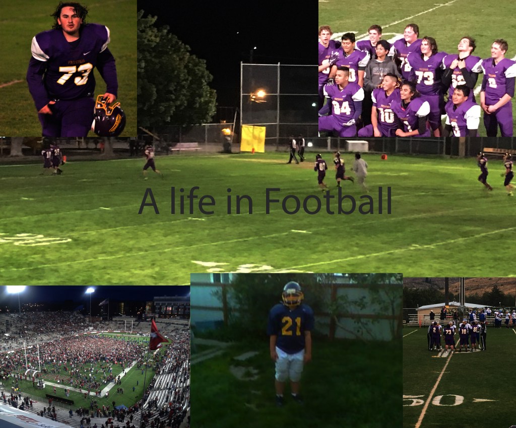
A Life In Football Final
After getting some feedback I changed the background from a colored picture to black in white because I thought the black and white made the other pictures stand out more. I added a broader to add more style to it. I also changed the font of the tile to a different font because it was better than just the plain original font. I then aligned the pictures on the bottom so they were all the same size
Here I am trying to tell my football life story from where I started to play in fifth grade to the end of my playing days last year. However, this is a on going story. Even though I stopped playing I hope continue in football by announcing. To me this is just the beginning.
To me sports have always been my life. I started when I was little with soccer, basketball, and baseball. Then I moved to football. To me it was probably on of the best decisions of my life. I do not know what might have happen if I did not choose football over soccer.
Back to the project. I found it hard to make the different kind of layers in making each picture its own. However, I did find a way to make them unique to highlight each other. This was all in different ways. The top right picture I brighten a little.
With the top left picture I lowered the color . In the bottom left I tried to make it’s hue/saturation different things on the levels. In the middle picture on the bottom I dabbled with it’s color. The picture on the bottom right was I also changed the color a tiny bit.
In all I enjoyed trying this project because it gave a challenge. It was my first time ever using Photoshop and I really enjoyed using. It was a great first time trying to learn something new in using Photoshop. I am glad that I got to learn all to use all of Photoshop’s tools in creating this project.
A life in football
I began a life of football just watching high school games at Lake Stevens, Washington. From there I would always watch college football on Saturday’s with my family. Then on Sunday’s my dad and I would watch the Seattle Seahawks. It wasn’t until I turned ten years old that I wanted to give football a try in real life.
Going into fifth grade I decided to put the shoulder pads and helmet on for the first time ever. It wasn’t until that first practice that I realized how hard football can be. If you want to be a good football player you always have to put in a lot of work. However, playing football that first year pushed me more in love with the great sport.
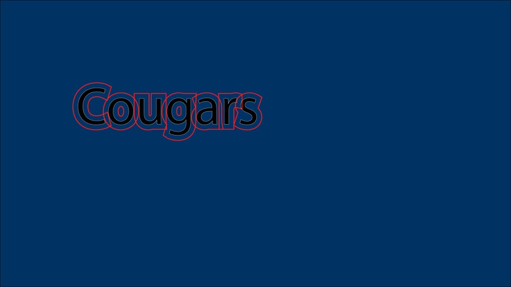
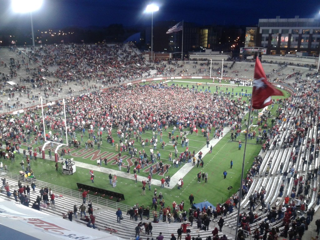
The second college football game I ever attended was right here in Pullman. The Cougars came back from eighteen down in the fourth quarter to win 31-28 in overtime. I remember leaving the game as the crowd flooded the field. As we started the walk to my brother’s apartment, we took a picture of how many fans were on the field as something to remember.
After fifteen years of living in Lake Stevens my parents decided to move us to my mom’s home town of Pateros. A small town of about 650 people. What I learned from this experience was that eight-man football is very different from eleven-man football. I felt that this taught me a lot of things. It introduced me to a lot of good and fun guys that shared my love for the game.
My junior year we made it to the first round of state playoffs but lost to a really good Sunnyside Christian team. That year we had a lot of fun games. The one I remember the most was a come from behind win against Republic where I felt we showed a lot of grit. We showed passion and got a 31-24 victory.
Senior year I became one of the captains. However, senior year I missed two games because of a concussion I suffered in practice. Those two games were probably the hardest two games of my career. I say this because I felt like I couldn’t do anything to help the team and I was so powerless in the game.
In the end I felt like playing football was one of the most important parts of my life. Even now I miss the game but that is why I am trying get my degree in broadcast news so one day I will hopefully be able to announce the game I love.

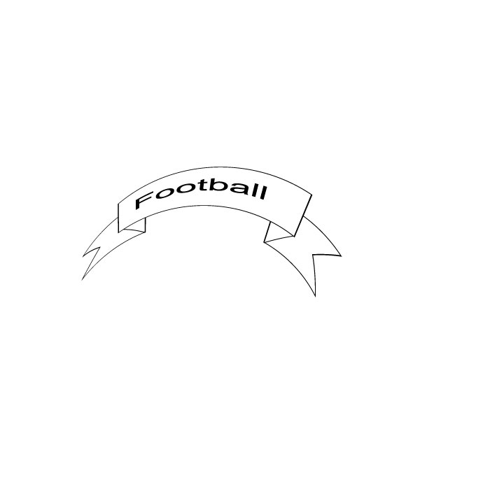
Images of Football
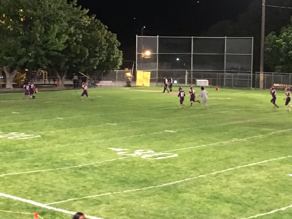
In this design project I plan to use football pictures from my life in football like my high school football games and games I’ve gone to taken by me and my family members for an event poster.
My First Blog Post
Introduction to this blog
We all love different kinds of sports. Some people love basketball, some love baseball, and many others. For me I love almost all sports. The one sport however that I love the most is Football.
I grew up always watching football on Friday at high school football games. Then at home on Saturdays watching college football. On Sundays I would always watch the NFL at home with my family. Football has always been a big part of my life.
I love football, everything about it. The hard work that goes into being ready for each week. The hitting, the satisfaction of making a good tackle on defense. The thrill of scoring a touchdown or just simply winning the game.
Playing football with my friends was probably the best time of my life. There is nothing every Friday being able to run onto the field and play a football game. That is why I choose football to be this blogs topic.
I plan to collect original materials pictures that I have taken at my football games in the past years. Also, videos from those games as well. Ideas that I have for two out the four units is one working on a design of logo different of my high school’s football helmet logo. The other is to do a work of every piece of equipment a football player needs for a football game.
Below are three links from my inspiration file for doing this topic of football. The first is of Facebook profile pic which is of me in my football uniform. The second is pictures taken by mom from past years of football games. The last link is of my school’s logo that I will be trying to make my own out of.
https://docs.google.com/document/d/1QYAhMk-a5xcKeDLhAxeGR3K5EmDFOr-AxQigRZ1q8N0/edit
https://docs.google.com/document/d/1bL6MqYzc8AEZPGPr4HMI7iDWP1lzANkTqRwN01XPg6U/edit
I hope that in the end many people will enjoy this blog and what I hope to create with it. This blog is not only for my enjoyment but for all kinds of football lovers.
